


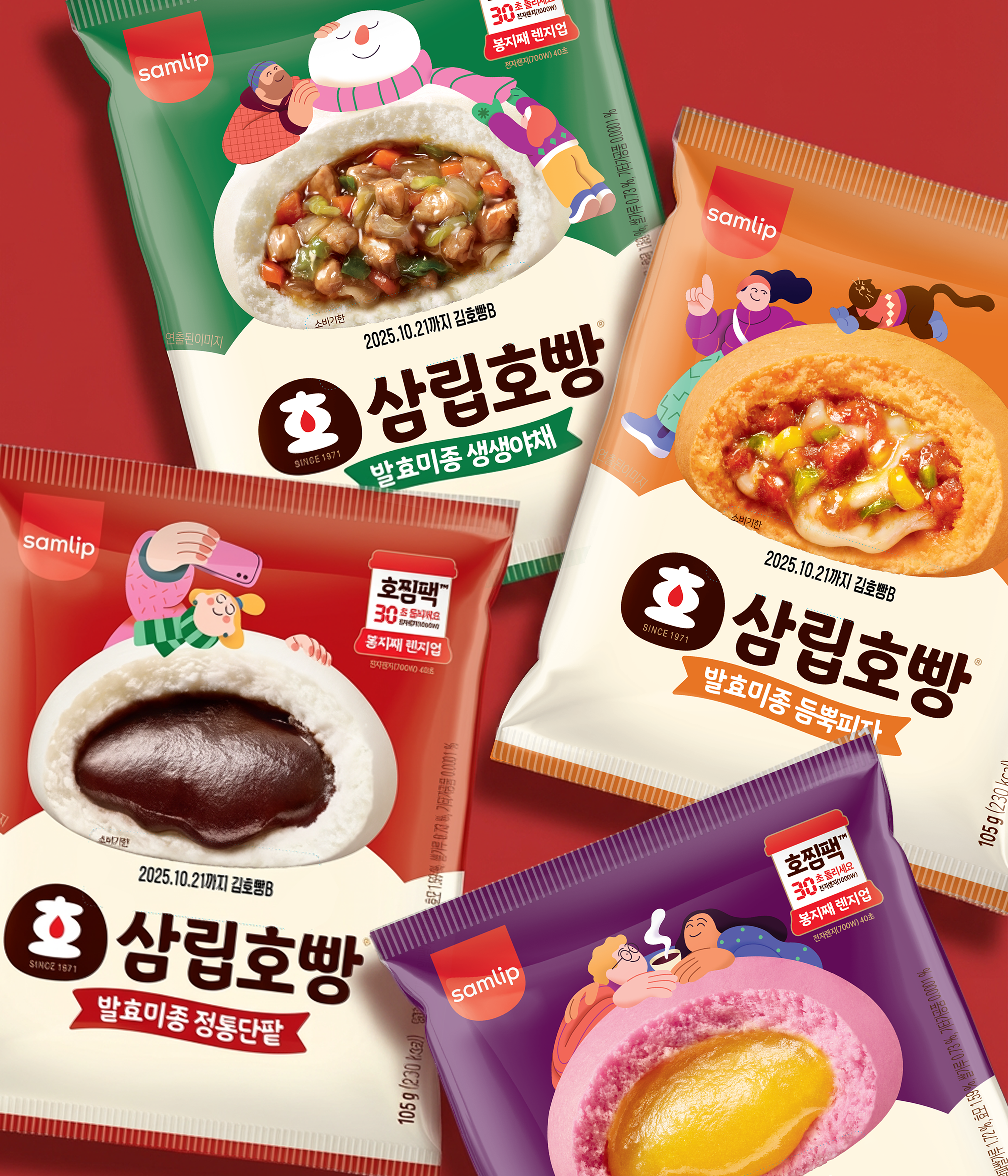


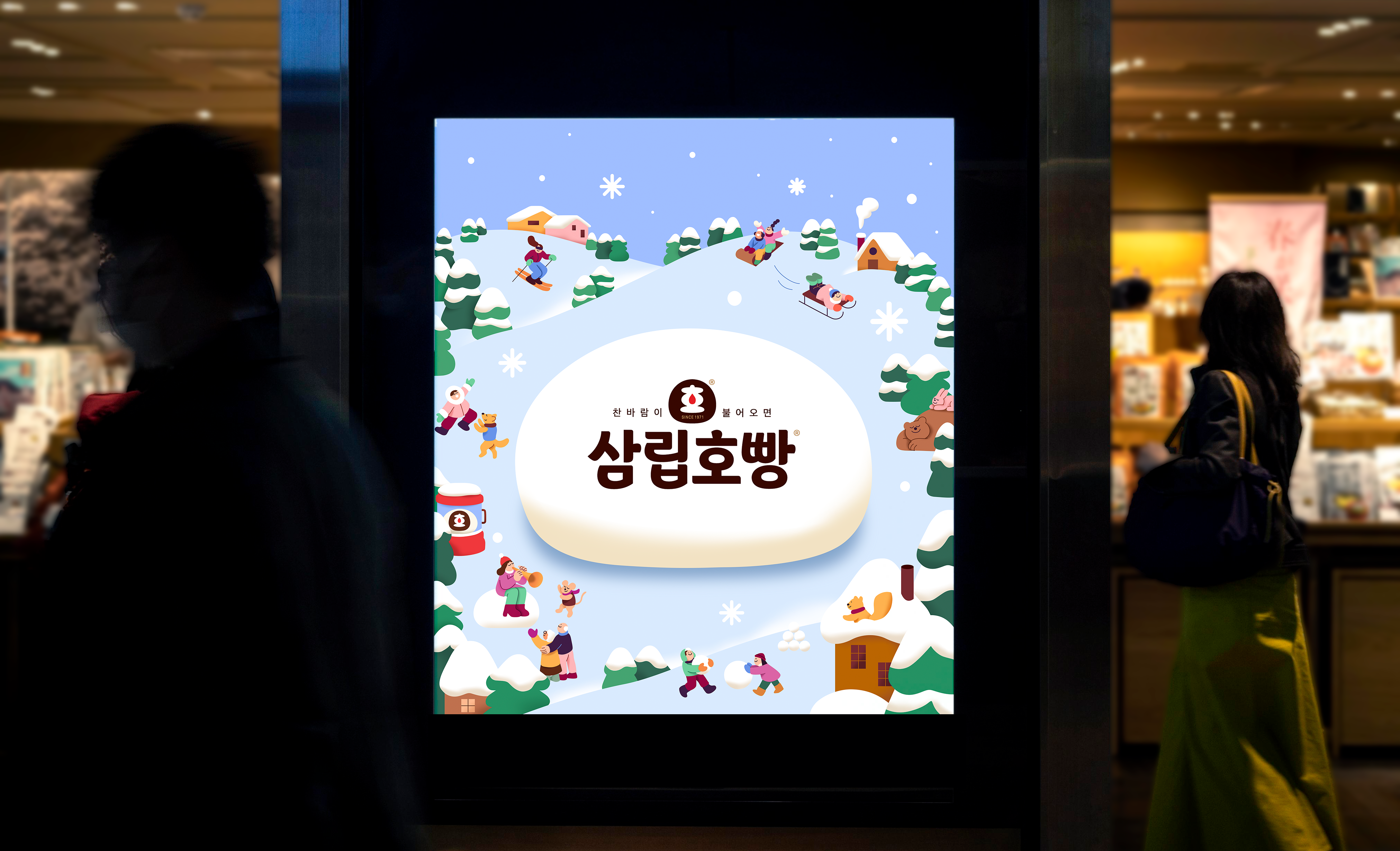
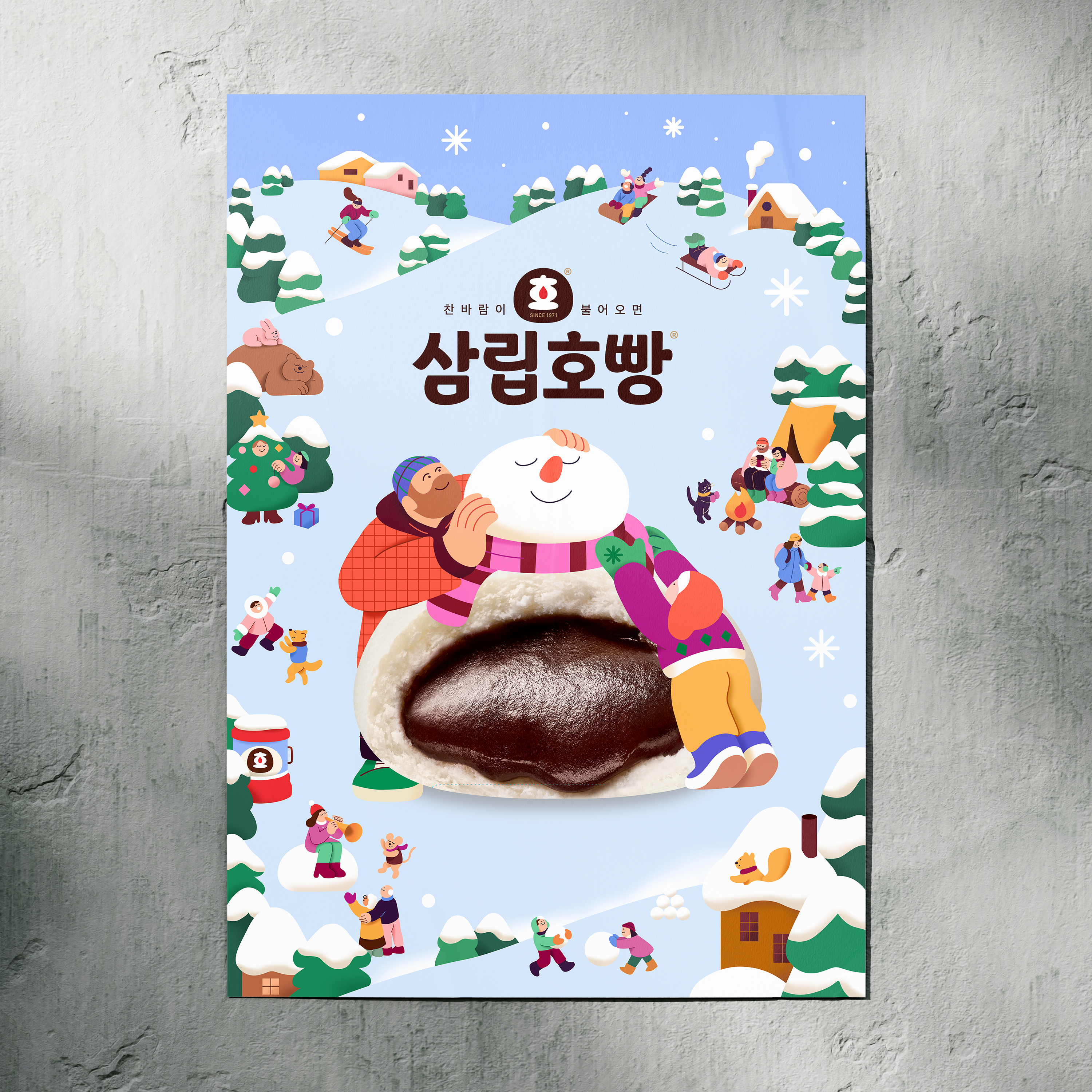
SPC SAMLIP HOPANG x AHRA KWON
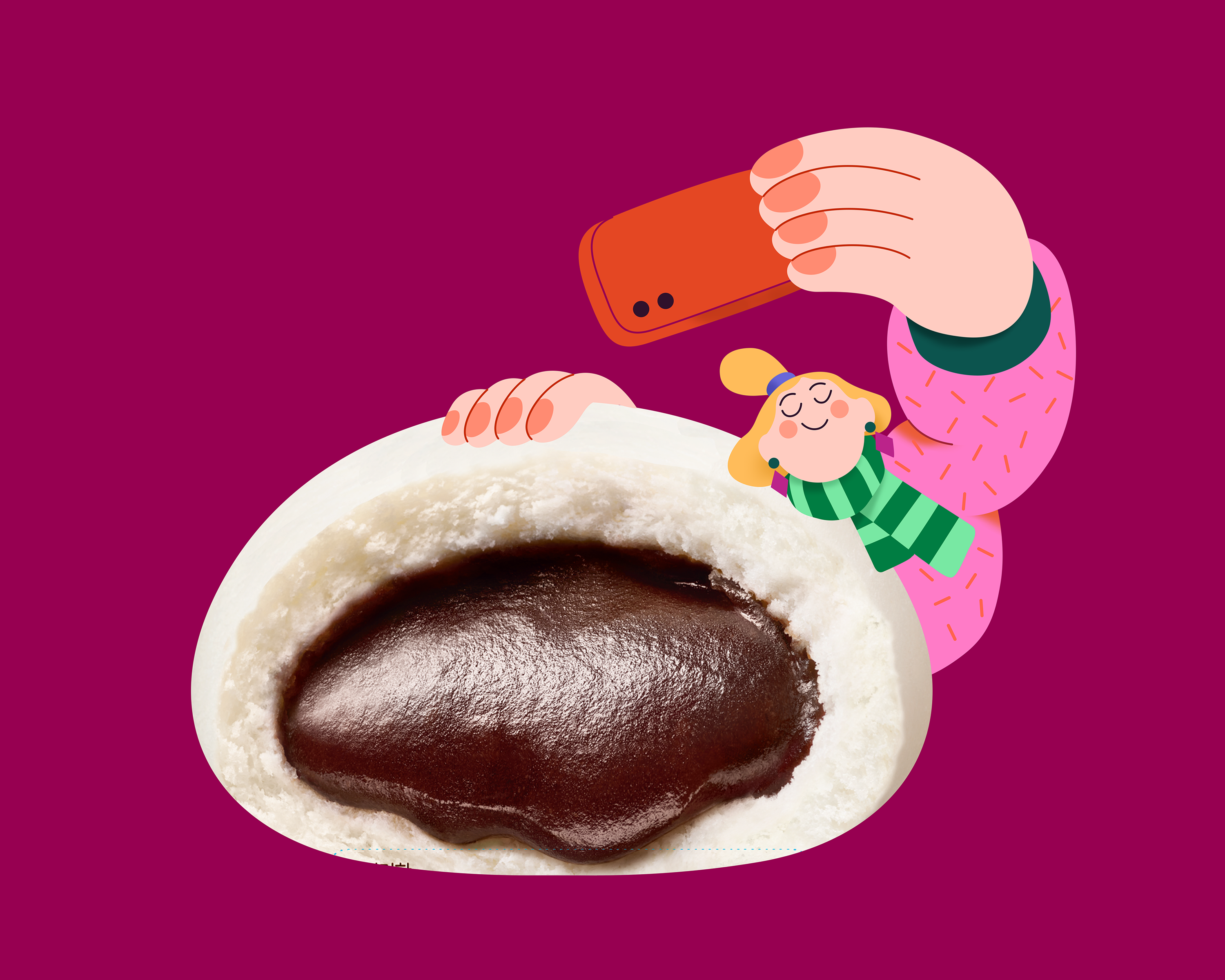
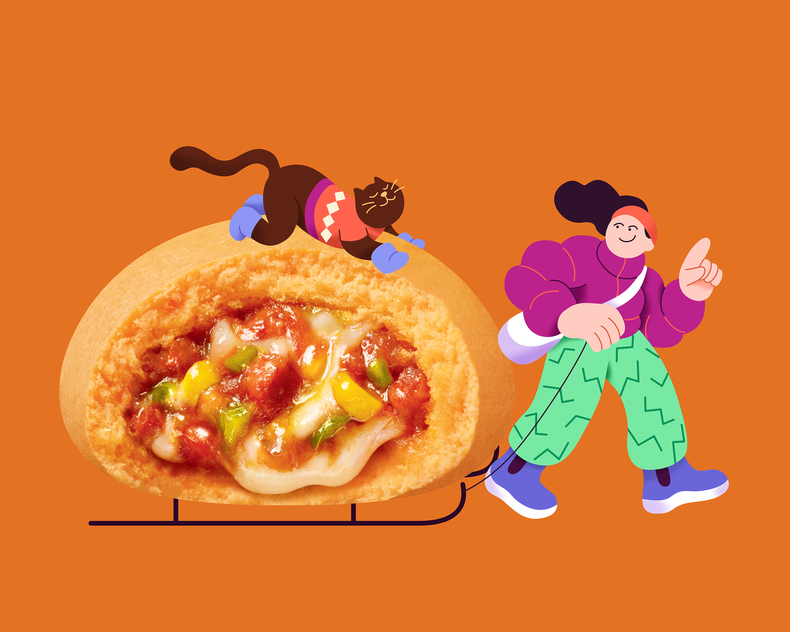
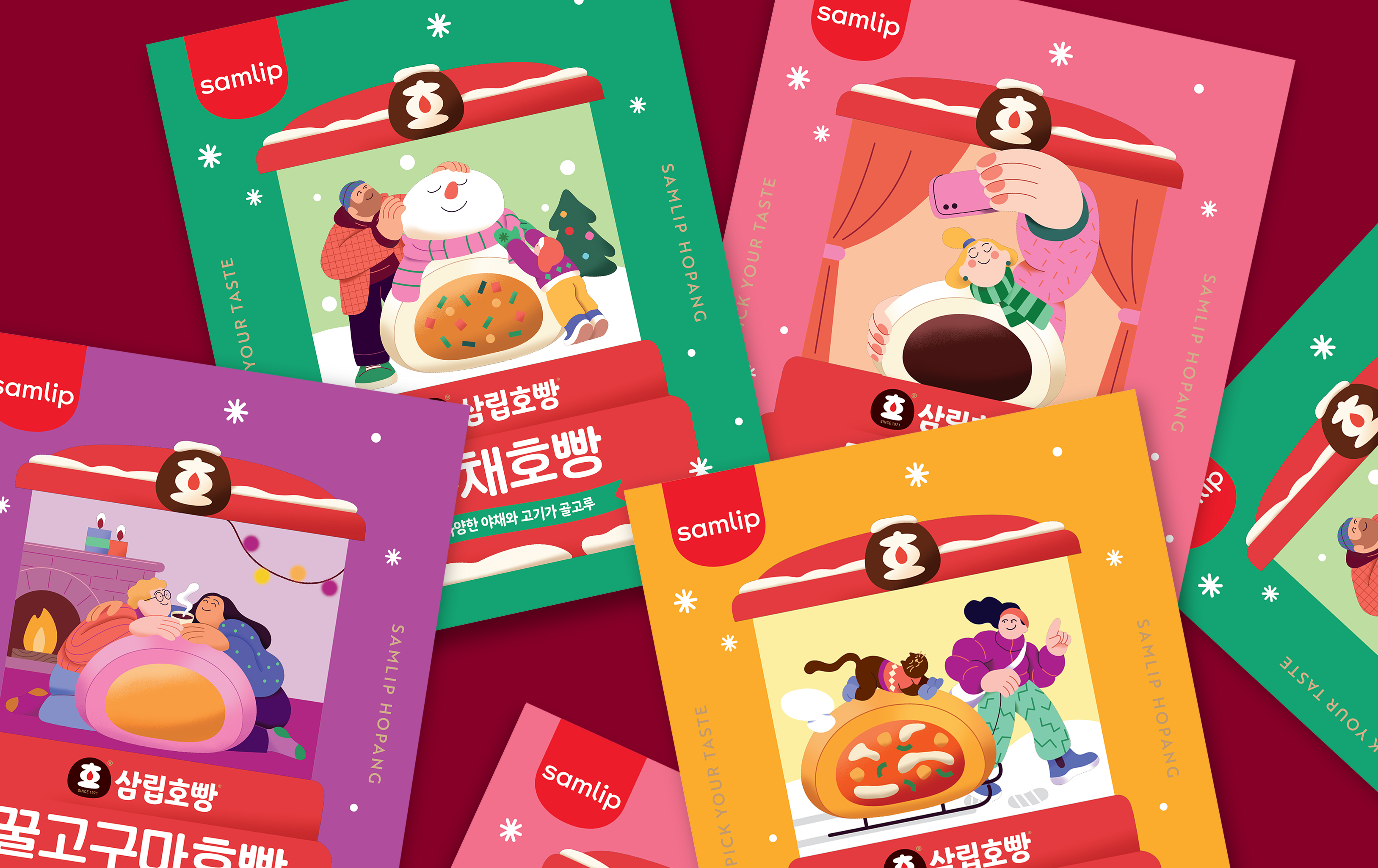
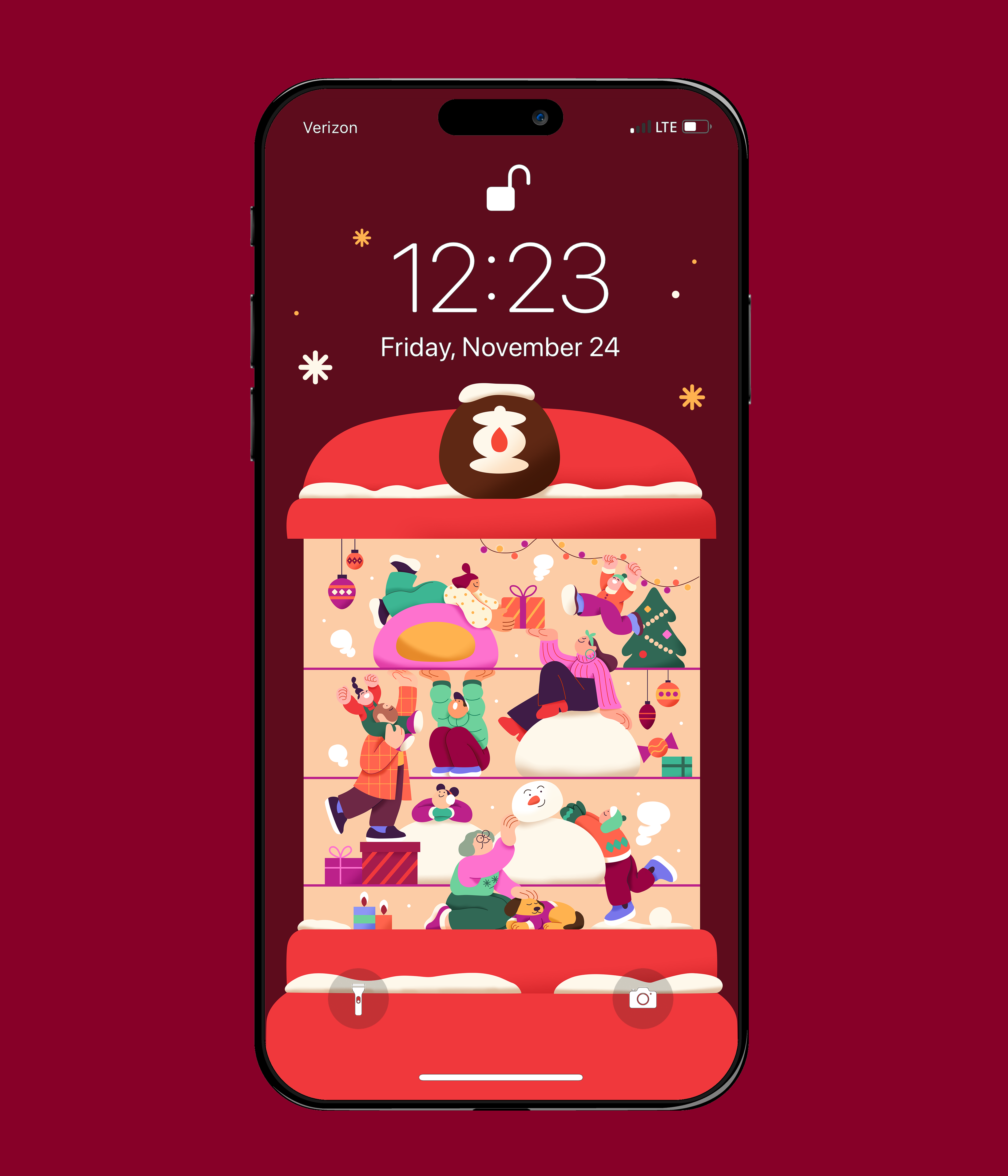
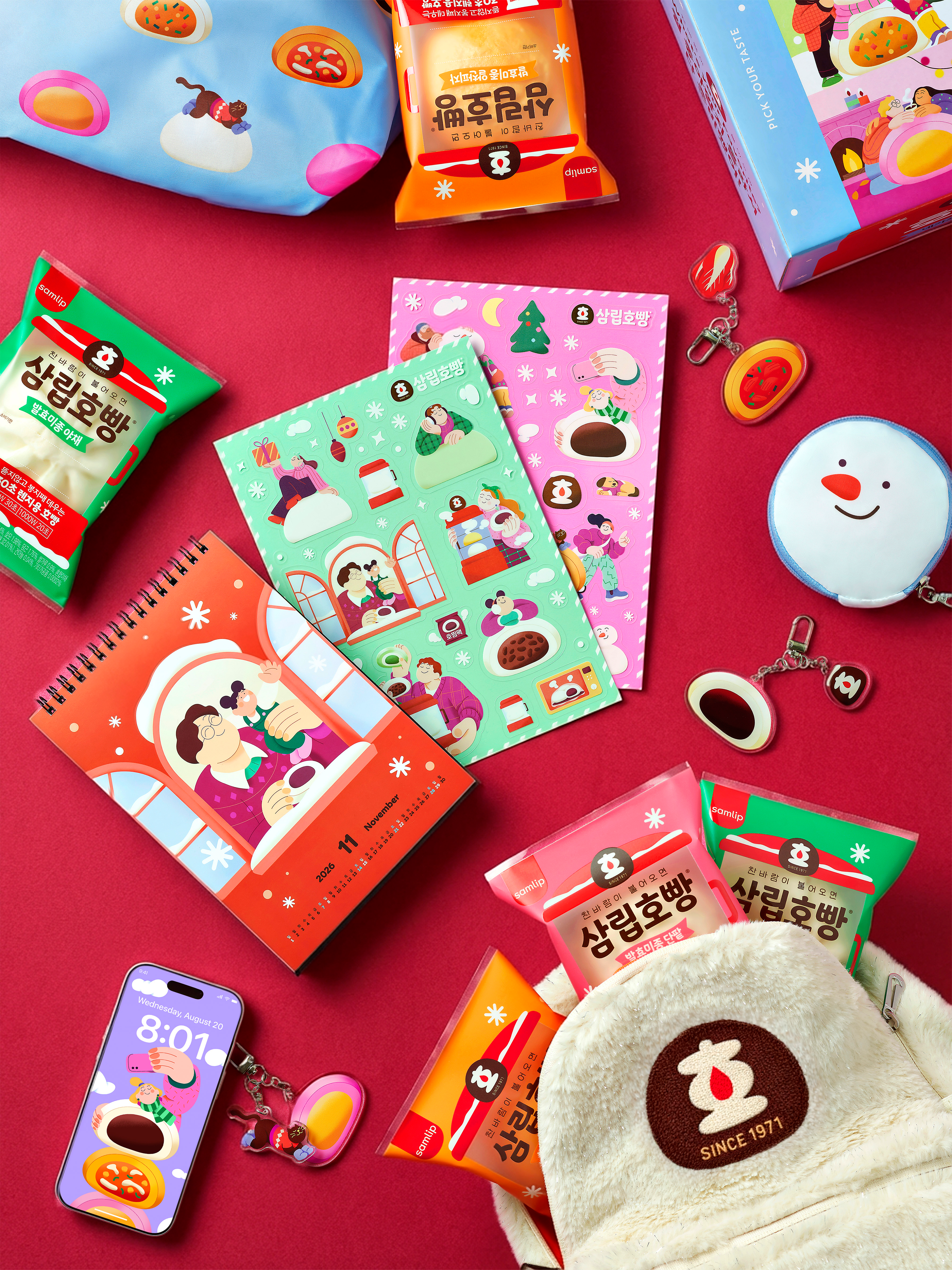
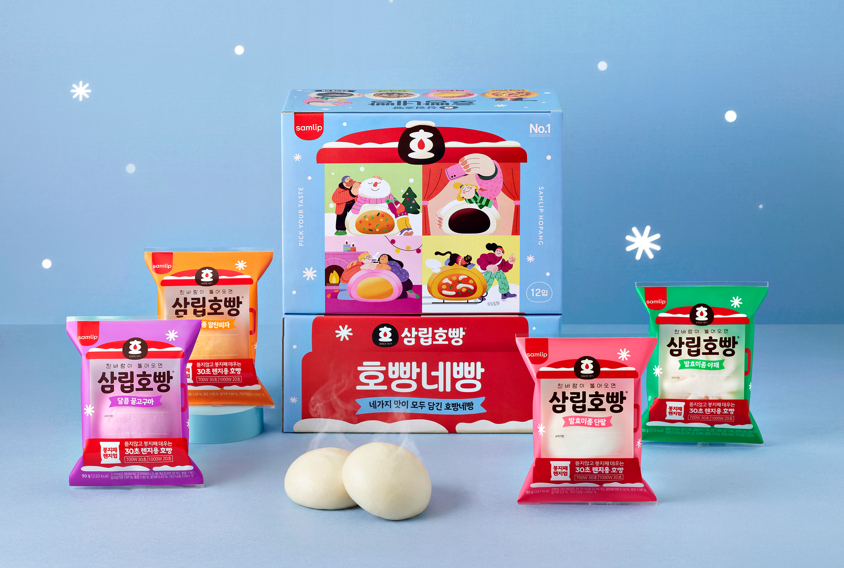
Created the winter key visual illustration and overall product packaging for SPC Samlip Hopang.
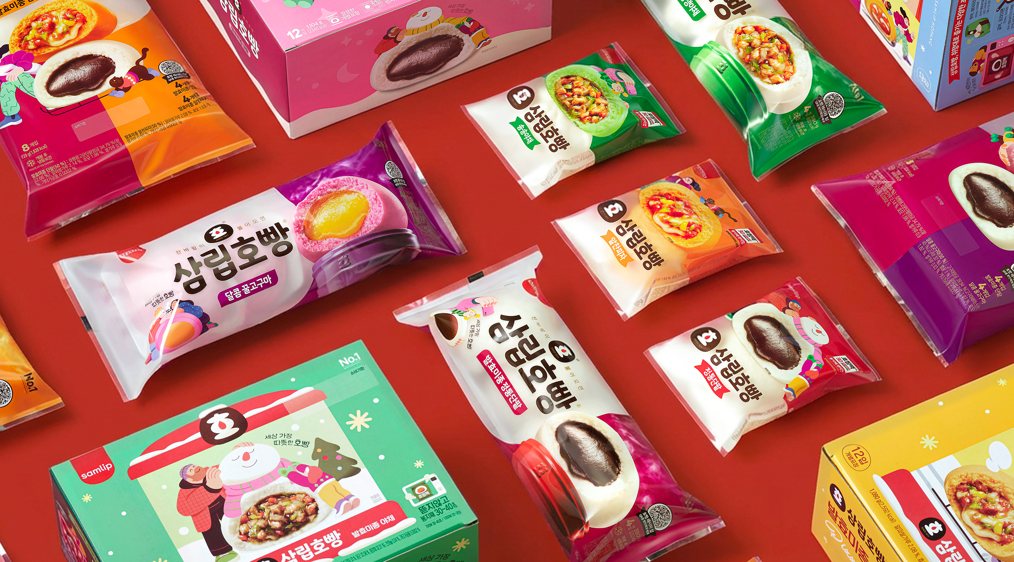
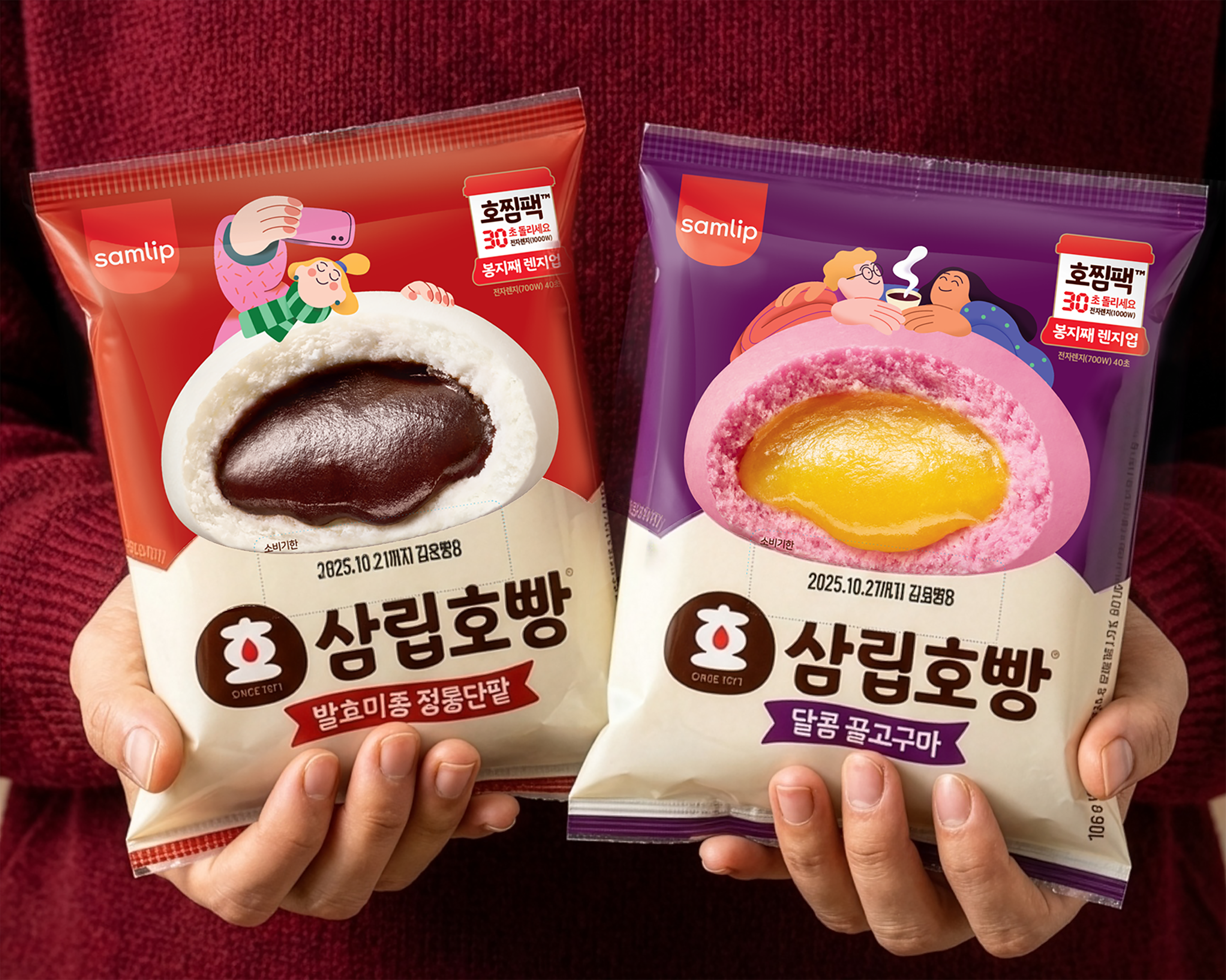
Hopang is a beloved Korean steamed bun that SPC Samlip first introduced in 1971, becoming one of Korea’s iconic winter snacks. The name “Hopang” combines the onomatopoeic sound “ho-ho” — the sound of blowing on hot food to cool it down — with ppang, the Korean word for bread, emphasizing the warmth and comfort of enjoying it straight from the steamer.
This project involved creating both the winter key visual illustration and package illustrations, focusing on a cozy seasonal mood and the familiar joy of sharing warm food during cold days.
Client: SPC Samlip
Designed by: Samlip design team
Illustration: Ahra Kwon